A Single Control Center for Real-Time Business Visibility
Management Analytics as the Core of Decision-Making
Analytics Dashboard Purpose
The MyErp Dashboard is not just data visualization but a management tool that consolidates financial, operational, and strategic information into a single interface. It enables business owners and managers to see the real state of the company in real time and make decisions without delay. The primary goal is to shorten the path from data to action. Unlike traditional reports, the focus here is on speed, aggregation, and interactivity.
The MyErp Dashboard operates strictly in read-only mode. This means users can view, analyze, and filter data, but cannot directly modify, create, or delete any records. All interface elements—charts, tables, KPIs, and widgets—are designed purely for visualization. In practice, this eliminates the risk of accidental changes and makes the Dashboard a safe entry point for analysis.
In MyErp architecture, analytics and operations are strictly separated. The Dashboard is responsible for analysis and decision-making, while any data changes are performed only in dedicated modules (finance, counterparties, projects). This approach prevents role mixing within the interface. In practice, it improves system control and reduces user errors.
Read-only mode provides an additional layer of data security. Even users with high-level access cannot accidentally modify critical metrics via the Dashboard. All changes go through controlled business processes and are recorded in the system. In practice, this is essential for auditing, control, and business compliance.
For clients, this means the Dashboard becomes a reliable single source of truth for decision-making. Users can freely explore data without the risk of damaging it. This is especially important for executives and investors who need fast and secure access to analytics. As a result, the Dashboard fulfills its core role—enabling business management without interfering with the data itself.
Practical Application
Current Status Control: Cash on hand (by currency); Profit / loss; Balance of income and expenses. Business Vitals: The level of "is the business alive right now."
Trend Analytics: How income/expenses have changed; Where the growth is / where the dips are; Which categories drive profit. Business Trajectory: The level of "where the business is heading."
Decision Making: When to cut costs; When to invest; When the business enters a risk zone. Actionable Strategy: The level of "what to do next."
Effective Use of the Analytics Dashboard
Clients use the Dashboard as a daily entry point into the system. It replaces dozens of reports, allowing key metrics—income, expenses, balance, trends, and anomalies—to be assessed in 1–2 minutes. This is especially critical for small and medium businesses, where reaction speed directly impacts profitability. In mature companies, the Dashboard becomes a KPI control tool and the foundation for regular management meetings.
Section: Finance and Accounting
The Finance and Accounting block displays aggregated financial data: income, expenses, profit, balance, and their trends over time. Each number is derived from actual accounting entries, transactions, and documents. These are not estimates—they reflect real business operations. This allows users not only to see numbers but to understand the structure of income and expenses. A key advantage is instant drill-down and filtering capabilities.
Practical Application
Clients use this block as a control point: if numbers look wrong here, the issue is either in the business or the data.
Widget: Currency Balances
The currency balance widget displays fund distribution across multiple currencies (UAH, USD, EUR, RUB). This is critical for companies dealing with international payments. It enables quick assessment of currency risks and liquidity structure. In volatile markets, it becomes a tool for financial stability.
Practical Application
Each balance value represents the current amount of funds in a specific currency. It is calculated as total inflows minus total outflows in that currency.
Clients use these numbers to monitor liquidity—whether they have enough funds in the required currency for obligations.
If UAH is falling, there is an issue with operations; if USD is rising, you are accumulating foreign currency; if everything is falling, it is a red alert.
Maximum impact comes from managing currency risk, such as holding more USD during rate growth or converting excess funds.
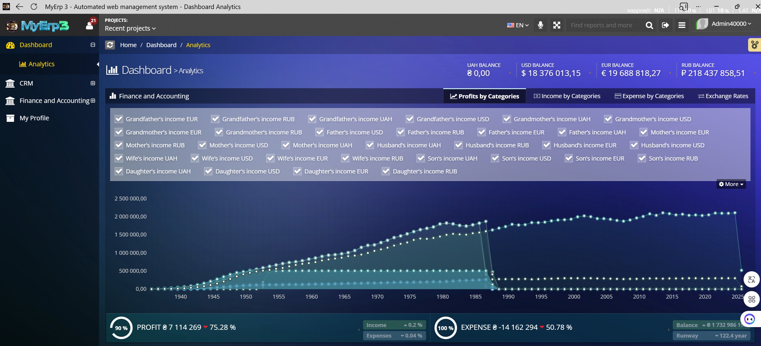
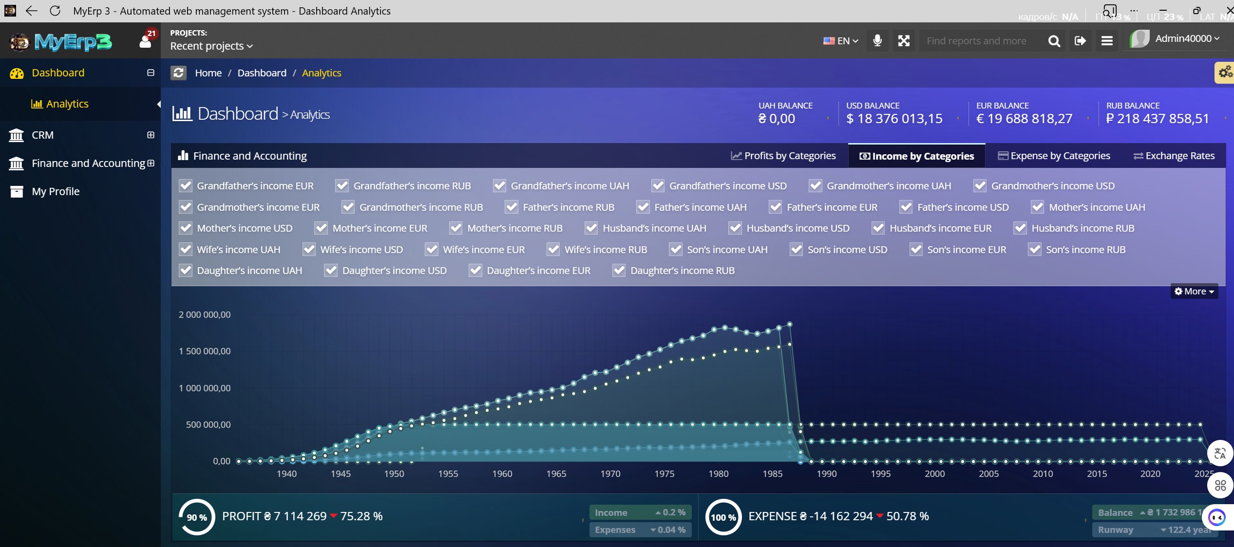
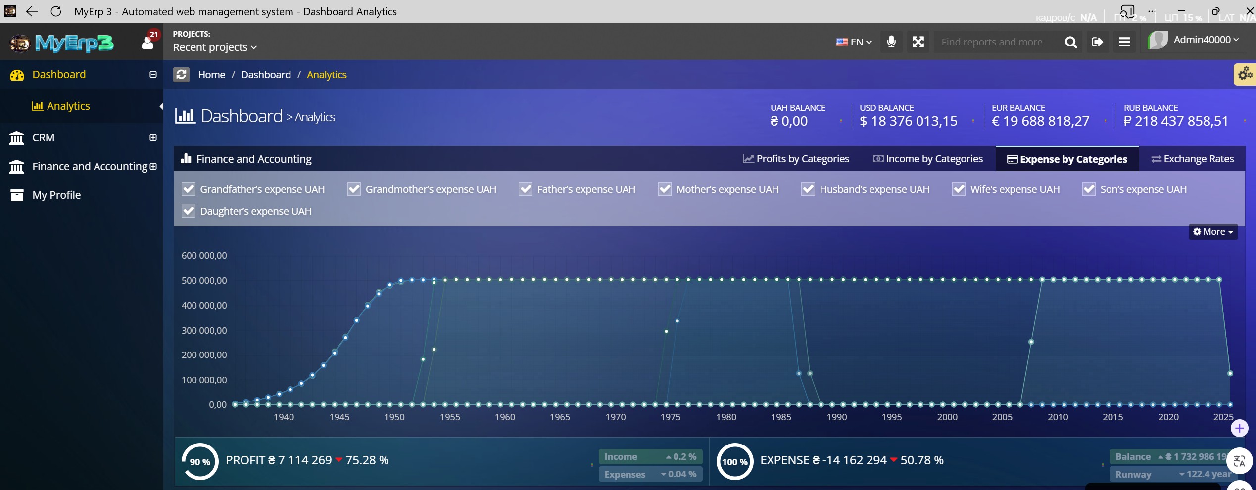
Widget: Income and Profit Chart
The income and profit chart shows business dynamics over time. It helps identify trends, growth points, and downturn periods. The ability to overlay categories and apply filters makes it a strategic analysis tool rather than just a visual element.
Practical Application
Trend Identification: growing → scale; declining → investigate. Source Comparison: who brings in the most revenue; which currencies dominate. Seasonality: peaks → replicate; dips → prepare. Key Value: This is not just a graph; it is the history of your business.
Maximum impact comes from early problem detection—if profit declines, action should be immediate, not delayed.
Widget: Category Filters
The filtering system allows users to select specific income and expense sources. This provides analytical flexibility—from high-level views to detailed breakdowns by counterparties or categories. This approach aligns with DDD principles, where users interact with business entities rather than abstract numbers.
Practical Application
Maximum impact comes from optimization—eliminating or reworking unprofitable areas.
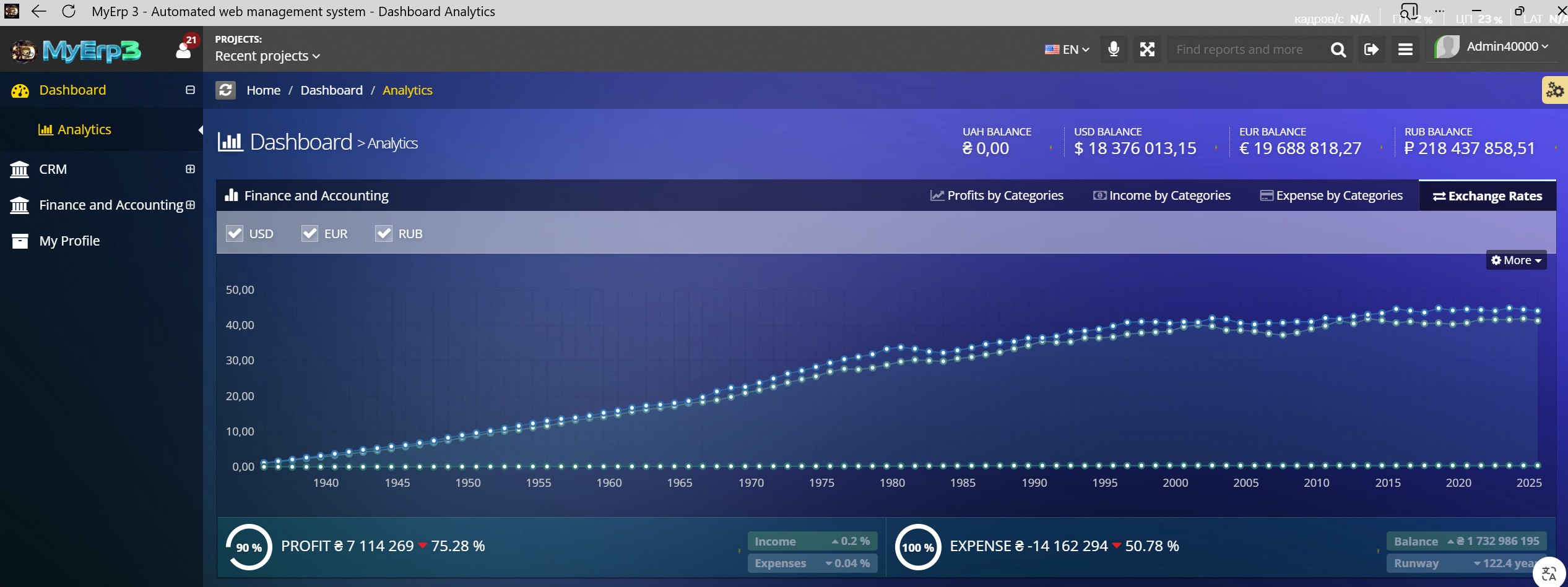
Widget: Exchange Rate Chart
The “Exchange Rate Chart” widget displays currency rate dynamics over time (e.g., USD, EUR, UAH). It integrates external market data with the company’s internal financial operations. Each value on the chart represents the actual exchange rate on a specific date. In practice, clients use this widget to support currency-related financial decisions. Maximum impact comes from reducing currency risk and improving margins.
Practical Application
The X-axis represents time — years. Each point corresponds to a specific year tied to a currency rate. In practice, clients use the timeline to analyze trends: growth, decline, or stability. Maximum impact comes from knowing the optimal timing for currency operations.
The Y-axis displays the numerical value of the exchange rate (e.g., 1 USD = 38.50 UAH). Each number represents the value of one currency relative to another. In practice, clients use these values to assess current money value. Maximum impact comes from making timely buy or sell decisions.
Each line on the chart represents a specific currency. For example, the USD line shows dollar fluctuations, while the EUR line shows euro changes. In practice, clients compare lines to evaluate relative currency stability. Maximum impact comes from choosing the most advantageous currency for holding funds or transactions.
Each point on a line represents a specific exchange rate on a given year. Hovering shows the exact value (e.g., 39.12). In practice, clients use these points for precise analysis—identifying when rates were more favorable. Maximum impact comes from capturing optimal periods for future decisions.
Widget: Profit / Expense KPI
KPI blocks display key metrics—profit and expenses—in an aggregated format. They include percentage changes, enabling quick assessment of business performance. This is a tool for instantly answering: “Are we growing or losing money?”
Practical Application
Clients use this as the primary performance indicator. Maximum impact comes from profit management—if the percentage drops, immediate analysis and corrective action are required. Comes from cost reduction—if expenses grow faster than income, it signals the need for optimization. Comes from sustainability management—understanding how long the business can survive without additional income.
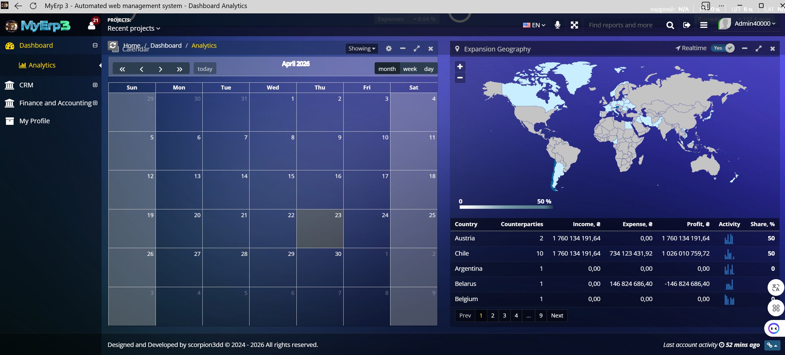
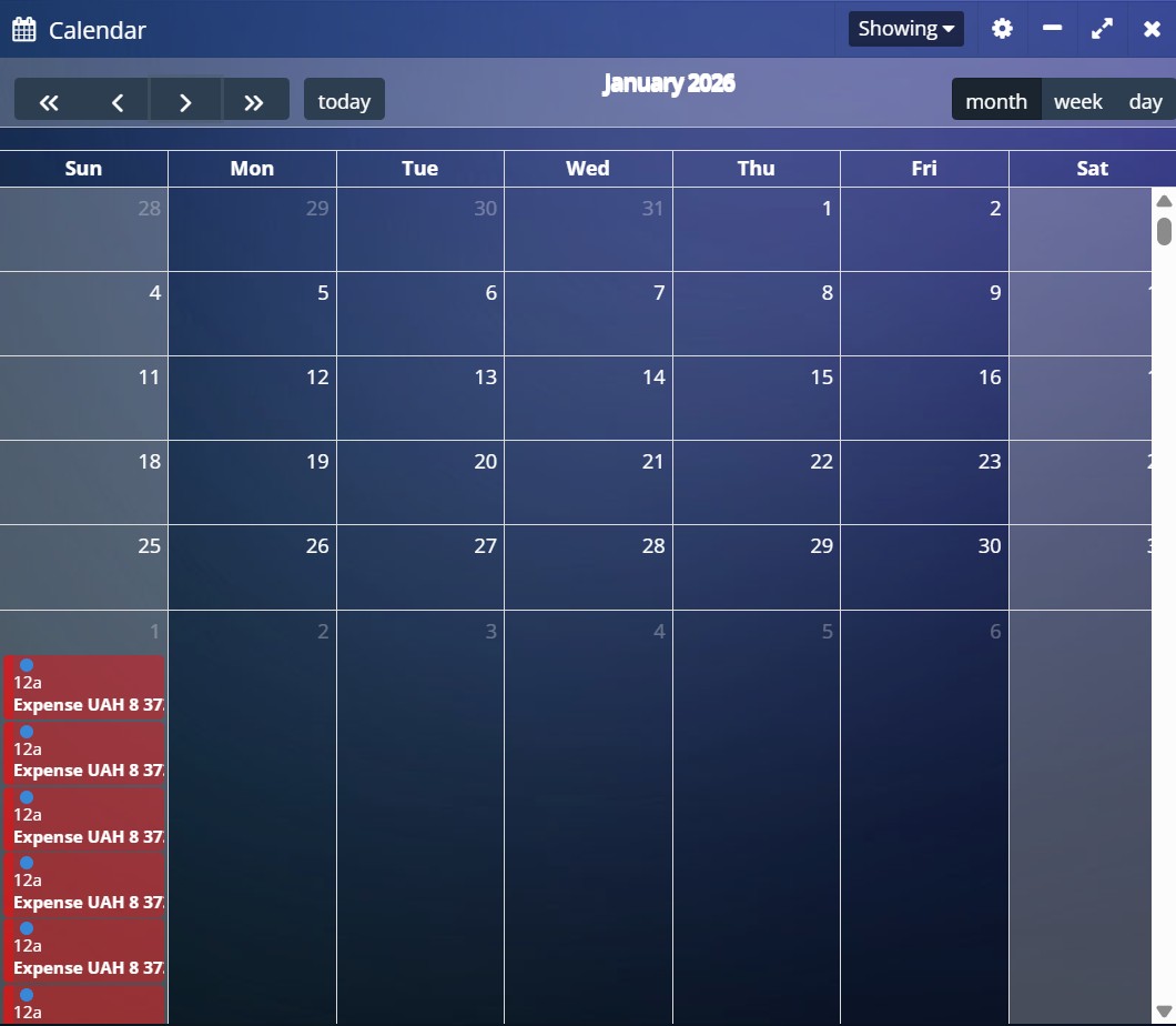
Widget: Calendar
The Calendar widget displays a time grid (days, weeks, months) with embedded financial events: income, expenses, payments, and obligations. Each date is not just a number but a reference point for business operations. The calendar is synchronized with accounting data and shows when financial movements occur.
The calendar integrates a time dimension into analytics. It allows financial events to be correlated with dates, revealing seasonality and cycles. This is especially useful for payment planning and cash flow forecasting.
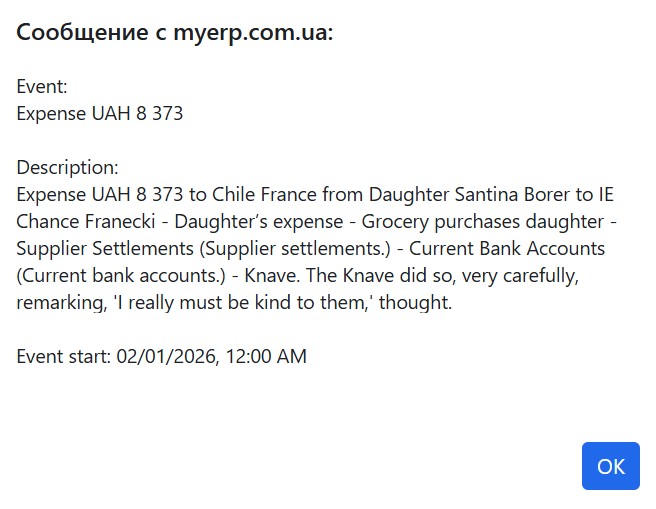
Clicking on an event instantly opens a detailed transaction card. This window doesn't just show numbers; it provides context: from whom, to whom, for what, and at what specific time the funds were transferred. This eliminates any "gray areas" in your reporting, making every operation transparent and audit-ready.
Every number in the widget has a specific meaning: the amount (e.g., 8,373) is the actual change in your balance, while the date is a timestamp, critical for liquidity analysis. The description inside the event fills these numbers with meaning, turning "dry" data into the history of concrete business actions, allowing for the flawless identification of every operation.
Practical Application
Clients use it as a planning tool—to understand not just how much money they have, but when it comes in and goes out.
Each number in the calendar - represents a specific day of the month linked to financial operations. If activity exists on a date, it is visually highlighted (color, marker, or number of transactions). In practice, clients use this to track recurring payments such as salaries, rent, and taxes. Maximum impact comes from financial discipline—ensuring key payments are tied to dates and never missed. Clients use this to assess daily workload—busy days require more attention. Maximum impact comes from managing operational load and prioritizing tasks.
The current date is highlighted (e.g., with a border or color) and represents “today.” It serves as the reference point for all operations. In practice, clients use it to focus on what needs to be done today—payments, invoicing, or tracking incoming funds. Maximum impact comes from managing daily obligations without delays.
View switches (month, week, day) allow changing the display scale. The monthly view shows the big picture, weekly adds detail, and daily focuses on specific operations. In practice, clients use this for different management levels: strategic (month), tactical (week), and operational (day). Maximum impact comes from controlling the business at all levels.
Navigation buttons (forward, backward, today) allow moving through time. This enables analysis of past periods and planning for future ones. In practice, clients use this for retrospective analysis and forecasting. Maximum impact comes from identifying seasonality—for example, sales growth in specific months.
The calendar delivers maximum value when used consistently: daily for tracking current payments, weekly for planning, and monthly for analysis. The key objective is to avoid cash gaps and anticipate financial peaks and downturns. As a result, the calendar evolves from a supporting widget into a cash flow management tool. If ignored, the business effectively operates blindly.
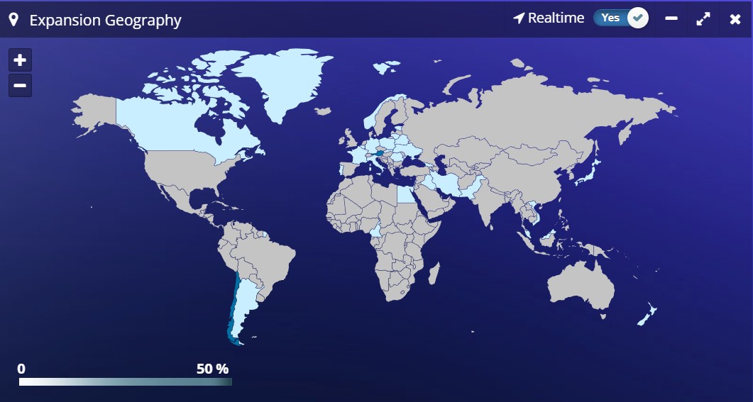
Widget: Expansion Geography
The “Expansion Geography” widget displays business activity distribution across countries on a world map and in a table. It combines financial and operational data, showing where the company earns, spends, and interacts with counterparties. Each country is a distinct analytical unit tied to real transactions and cash flows. In practice, clients use this widget for strategic market analysis. Maximum impact comes from understanding where the business truly operates versus where it only appears active.
Practical Application
The color intensity of a country on the map represents the level of activity or business volume (e.g., revenue or number of transactions). The stronger the color, the higher the value. This provides an instant visual assessment of geographic concentration. In practice, clients use the map to quickly identify key markets. Maximum impact comes from focusing on high-potential countries and spotting “white spaces” for expansion.
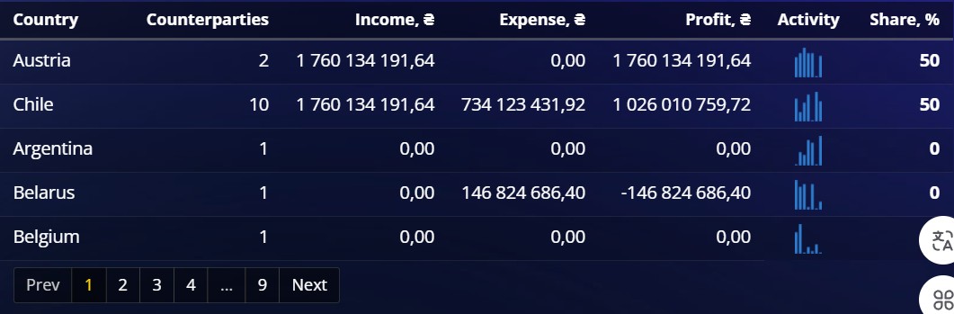
Widget: Country and Activity Table
The country breakdown table provides detailed analytics: income, expenses, profit, and activity. It allows quick identification of profitable and unprofitable regions. Combined with charts, it forms a полноценный BI layer within the ERP.
Practical Application
The “Country” field in the table identifies the specific country associated with transactions. It is the base unit of analysis to which all other metrics are linked. In practice, clients use the country list to segment their business. Maximum impact comes from building strategies per market rather than relying on averages.
The “Counterparties” metric (e.g., 10) represents the number of unique clients or partners in a given country. It reflects market presence breadth. In practice, clients use it to assess diversification—more counterparties mean lower dependency risk. Maximum impact comes from balancing quantity and quality of clients.
The “Income” metric shows total revenue generated from a specific country. It is the sum of all inflows from counterparties in that country. In practice, clients use it to assess market attractiveness. Maximum impact comes from investing in high-revenue, high-growth markets.
The “Expense” metric reflects all costs associated with a country, including procurement, logistics, taxes, and other expenses. In practice, clients use it to evaluate the cost of operating in a market. Maximum impact comes from cost optimization and identifying expensive markets.
The “Profit” metric is the difference between income and expenses for a country. It reflects true market efficiency. In practice, clients use it to decide whether to expand or reduce presence. Maximum impact comes from focusing on profitable markets rather than just revenue.
The “Activity” metric visualizes the level of activity (e.g., charts or bars). It may include transaction count, interaction frequency, or business intensity. In practice, clients use it to understand dynamics—whether a market is active or stagnating. Maximum impact comes from reacting early to declining activity.
The “Share %” metric shows a country’s share in the overall business (e.g., 50%). It is a relative measure that enables comparison across markets. In practice, clients use it to assess dependency on specific countries. Maximum impact comes from risk reduction—overreliance on one country is a potential threat.
Maximum value is achieved by regularly comparing countries based on income, profit, and share. The key is not just to view numbers but to make decisions—where to expand, optimize, or exit. This widget transforms geography from a map into a growth management tool. Ignoring these insights leads to inefficient scaling.
The MyErp Dashboard is not a final product but a continuously evolving system built on kaizen principles. Its value lies not only in current metrics but in its ability to adapt to changing business processes. Small improvements in UI, analytics, and responsiveness compound into significant business impact over time. For IT, product, and investors, this means one thing: the system becomes not just an accounting tool but a mechanism for continuous growth and optimization.
“Philosophy Kaizen”